Book design
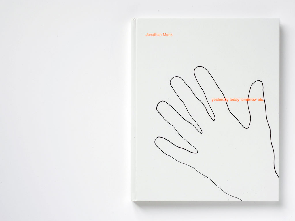
Artist: Jonathan Monk
Title: yesterday today tomorrow etc.
Year: 2006
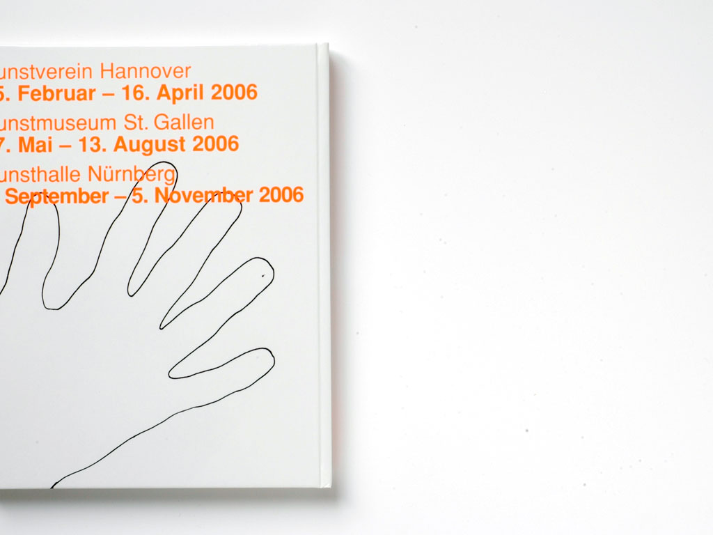
Publisher: Kunstverein Hannover / Kunstmuseum St. Gallen / Kunsthalle Nürnberg
Production: Revolver, Archiv für aktuelle Kunst, Frankfurt am Main
Editor: Stephan Berg, Ellen Seifermann, Rolan Wäspe
Essais by Stephan Berg, Konrad Bitterli, Ellen Seifermann
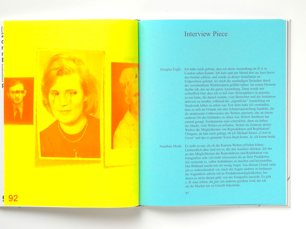
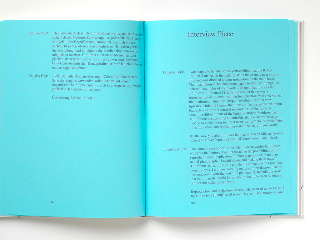
Interview Piece: Douglas Fogle and Jonathan Monk
German/English
Size: 26 x 21 cm [10 1/4 x 8 1/4 in.]
Number of pages: 156 + endpapers
Printing: Offset (black, 4-color process, spot colors) on several paper stocks
Binding: Hardbound
Cover: Laminated paper, silk screened text
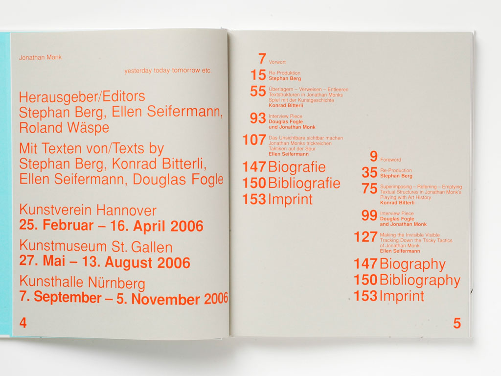
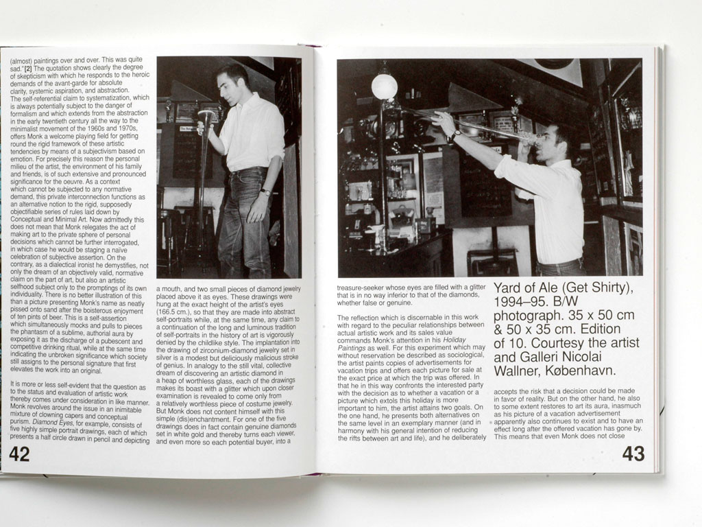
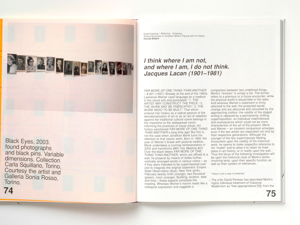
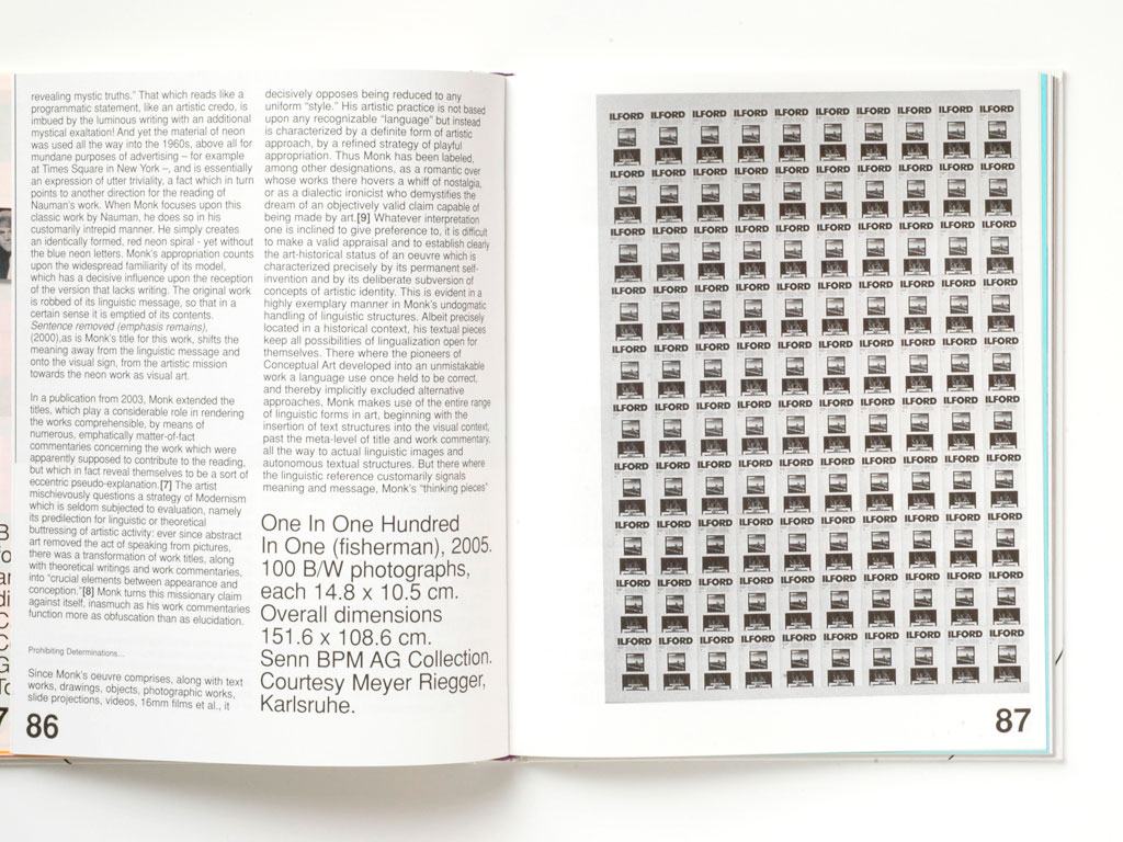
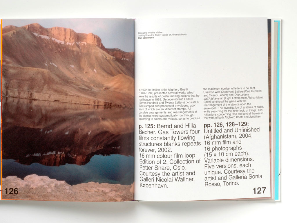
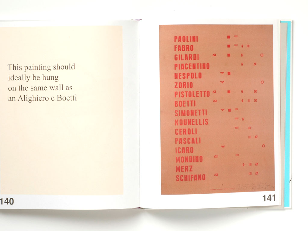
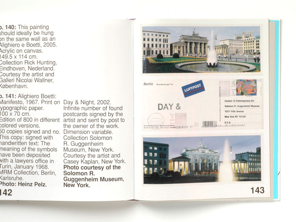
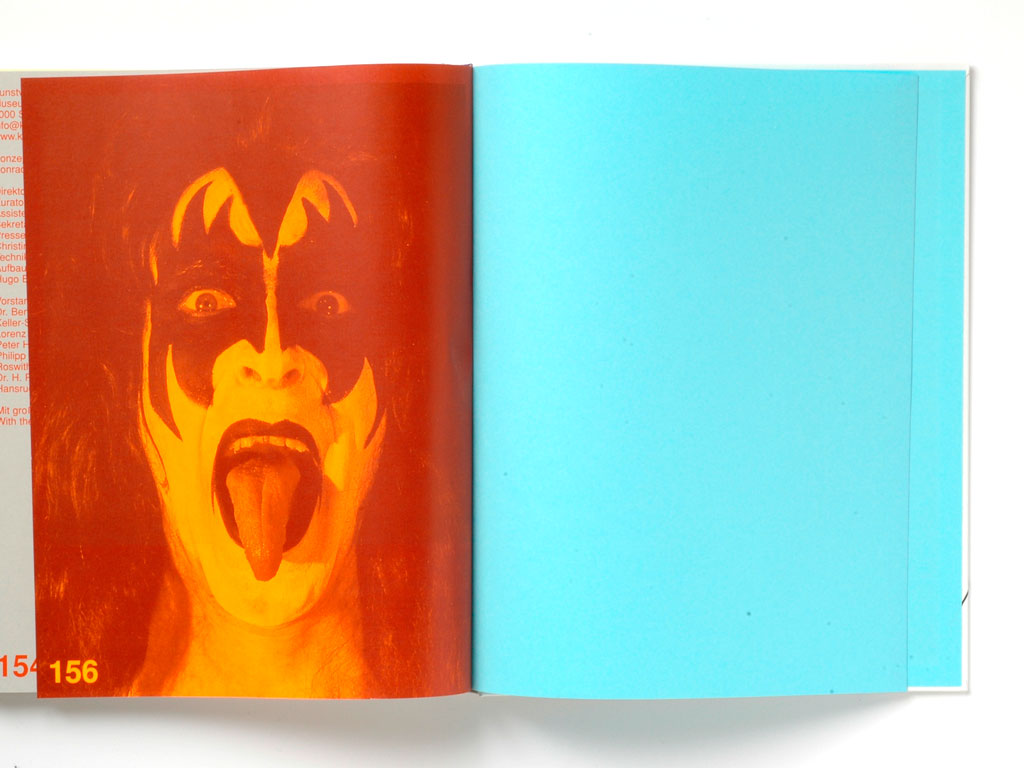
This exhibition catalog is a monograph on Jonathan Monk’s work. In view of the fact that Monk frequently plays with references and quotes, I thought it would be interesting to invert the habitual typographical hierarchy used to reflect hierarchy in information and see how far this could be pushed while remaining perfectly legible and understandable. Using Helvetica only, the running text is set at an usual size; however, the titles are smaller and the captions, endnotes, and page numbers are set in a much larger font size and in bold. This inversion put much emphasis on peripheral information such as endnotes, references, etc. and the enlarged page numbers happened to lend the book the allure of a children's book.
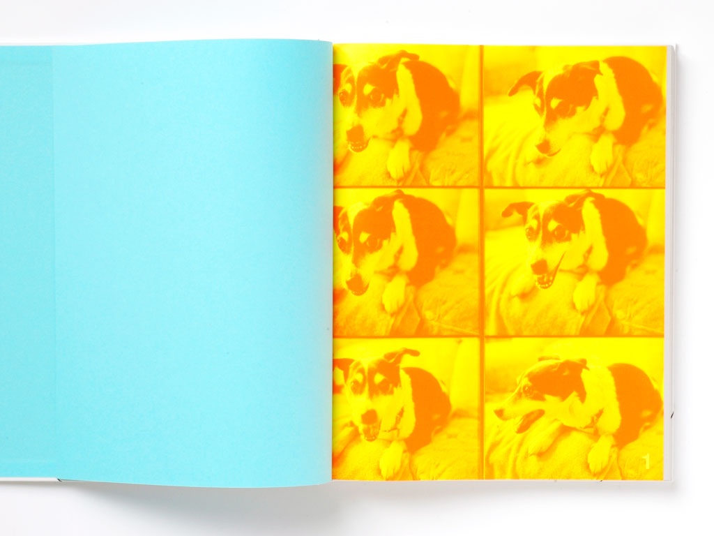
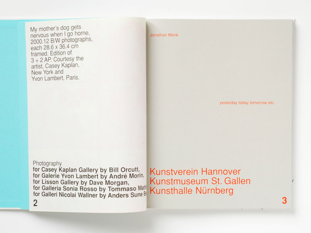
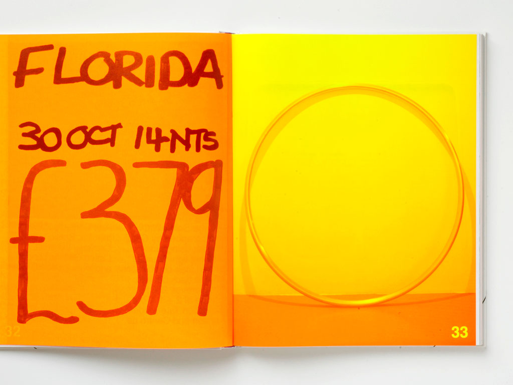
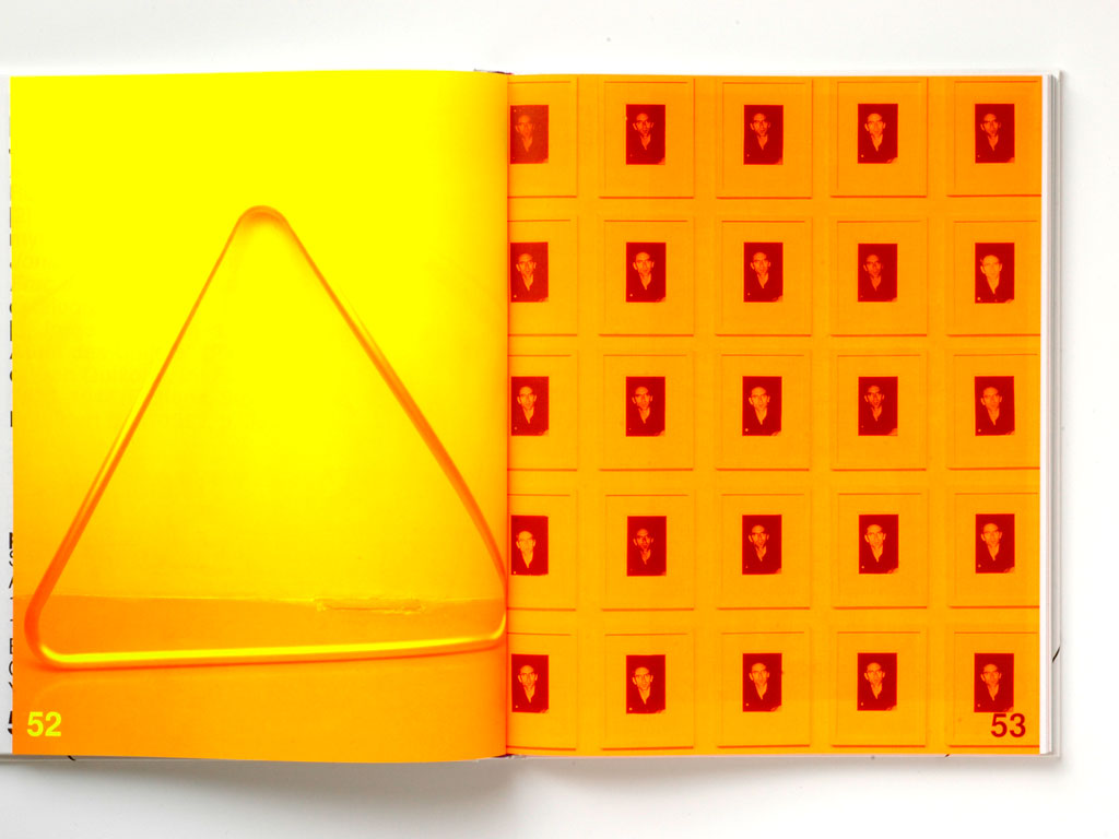
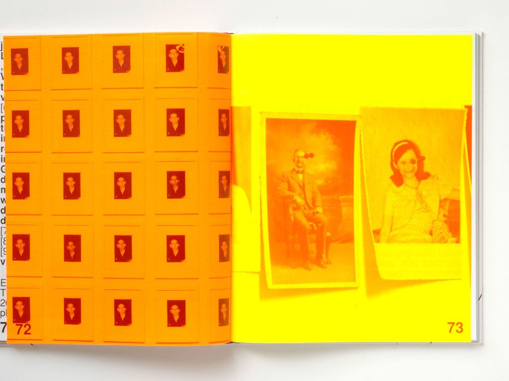
Apart from the front and end matters, the book is divided into six equal parts. Each part corresponds to one of the three essays in German or English, which is contained in one binding signature. Each binding signature is separated by alternating flourescent yellow and orange sheets typically used for flyers. Inserted in the book is an additional part, containing an “Interview Piece” printed on the same blue paper stock as the endpapers, and designed in a totally different layout and font.
The text on the cover uses the same reversal of the information hierarchy. I asked the artist if he wanted to do something for the cover that would make the book into a piece. He responded by sending me a tracing of his left hand and a tracing of his right hand. I slightly rotated these drawings on the front and back cover so that it looks as if the artist was showing us how to hold the book.